
A cleaner structure with stronger energy and clearer actions
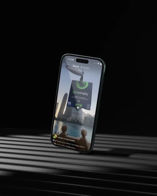
5Comply Academy is a compliance learning platform. The client asked us to elevate the homepage. The previous look was simple and less vibrant. Our goal was to keep the good structure, then bring a modern and more tech forward visual language with clearer actions and a stronger sense of credibility.
We focused on information hierarchy, copy clarity, and UI polish. We introduced motion cues, refined typography, updated color use, and improved spacing so visitors understand the value faster and move smoothly to Explore Courses and Enroll.
What did our client Requested
A more modern and credible homepage. A design that feels energetic and technology driven while staying professional. Clear paths to Explore Courses, Enroll, and Contact. Stronger proof and easier scanning on mobile and desktop.
What we Delivered
UX review and updated information architecture that keeps familiar sections and improves flow
Wireframes and high fidelity UI in Figma with responsive layouts and clean spacing
Strong hero with a clear headline, short value points, and a single primary call to action
Refreshed visual language with confident typography, subtle gradients, and refined icons
Simple micro interactions that guide the eye and support click intent
Course discovery that highlights categories and key programs without friction
UX writing that is plain, human, and search friendly
Accessible contrast and clear focus states for keyboard navigation
Practical performance guidance on image export and media loading
GA4 event plan for primary CTAs, course card clicks, and scroll depth
Based on GA4: Higher engagement, deeper scroll, and more clicks to explore courses and Enroll
More Case Studies

CP Herbalist – Growth Partner for a Natural Brand
Sales doubled year-on-year through bundled activations.

Hybrid Fitness Gym
Delivered a bold and energetic look, laying the foundation for launch.
5Comply Academy: A homepage that drives enrollments
Based on GA4: Higher engagement, deeper scroll, and more clicks to explore courses and Enroll